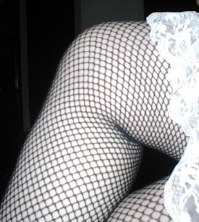
For my second poetry book, Saturn and Satin...I created two different colors of the image I want to use. A transparency of Saturn over a photo of Satin. I chose 5 people ( Lorraine, Jeff, JS, Jo and Steve) off my email list whose wisdom I trust. Below is the email I sent to them as a group and their replies.
From Me:
hey... do me a favor and scope out the two images I created today for the cover. Let me know which you like the best...pretty please...
I'm giving out door prizes to the first 50 people.
http://www.opalrose.com/saturnandsatin.html
I think I'm partial to the blue.~S
~ ~ ~
The replies in order of arrival:
Lorraine: I like the blue color, but I like the angle on the pink pic better. I know, I know...leave it to me to be the "difficult" one lol.
Jeff: definitley the blue one
Jo: The pink seems to be a stronger image.... i do like the blue but for shelf appeal i would choose the pink... might be an idea to see what its like with the text over it..that will give a different view altogether....what about using both.... one front one back... just an idea.
Steve: I think I like the reddish cover better. The blue one seems cold.~Steve, art critic
JS: I like the blue, but blue is my favorite color, so my vote may be tainted....waaaaaiiit a minute. there are only 5 people on the list....so I have to be one of the first 50 people. While I feel slightly tricked, I won't complain if the door prize involves a blow job.
~ ~ ~ ~
Maybe I should go with lavender!!!!!
Wednesday, March 09, 2005
Subscribe to:
Post Comments (Atom)

1 comment:
the pinke is best
Post a Comment